SkillBridge
Connecting Learners With the Right Instructors
What is SkillBridge ?
SkillBridge is a platform that connects learners with skill-based classes by helping them find courses that match their interests, learning level, and preferred format. The platform makes it easier for users to search for and choose classes, provides clear and transparent information, and supports confident decision-making throughout the learning journey.


Project at a Glance
Role
UX / UI Designer
Duration
6 Weeks- Part Time
Team
4 Members
Tools
Figma, Miro, ChatGpt, Teams, Maze


Problem Statement
This platform was created to address the gap between tutors who can teach various skills and learners seeking to acquire them. Many learners struggle to find qualified tutors, while tutors often lack an easy way to reach interested students. The site serves as a bridge, enabling direct and seamless interaction between tutors and learners, facilitating effective skill-sharing and learning.
Stakeholder Needs
Learners:
Access to both online and in-person classes.
Option to join individual sessions or package courses (single or multiple sessions).
Benefit from discounts or special offers when enrolling in multiple classes.
Clear and reliable information on tutor skills and experience for better decision-making.
Tutors :
Ability to showcase their skills and experience through personal profiles.
Profiles are verified by the platform to ensure trustworthiness for learners.
Simple tools for managing classes, bookings, and direct communication with students.
Current Phase:
At this stage, stakeholders have requested our focus on tasks related to learners, aiming to enhance their learning experience.
The Process
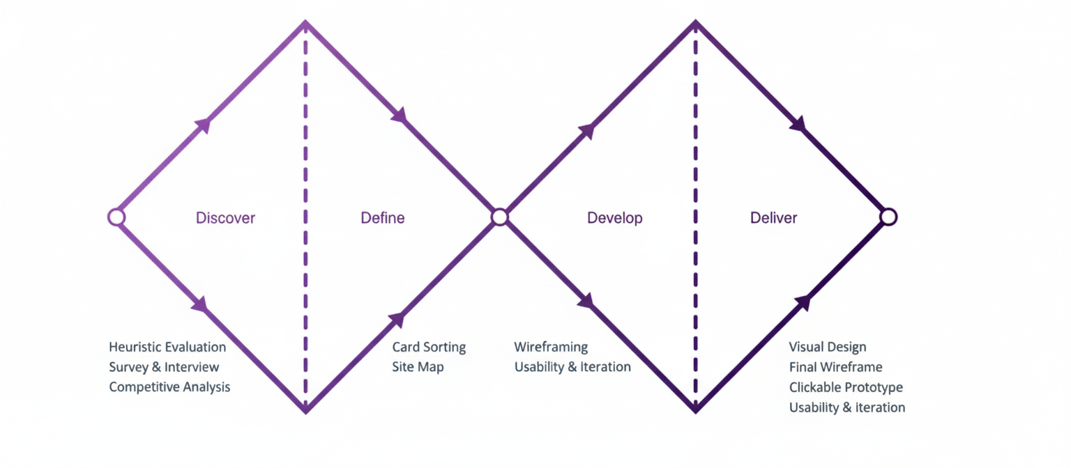
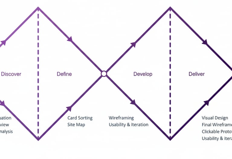
Discover
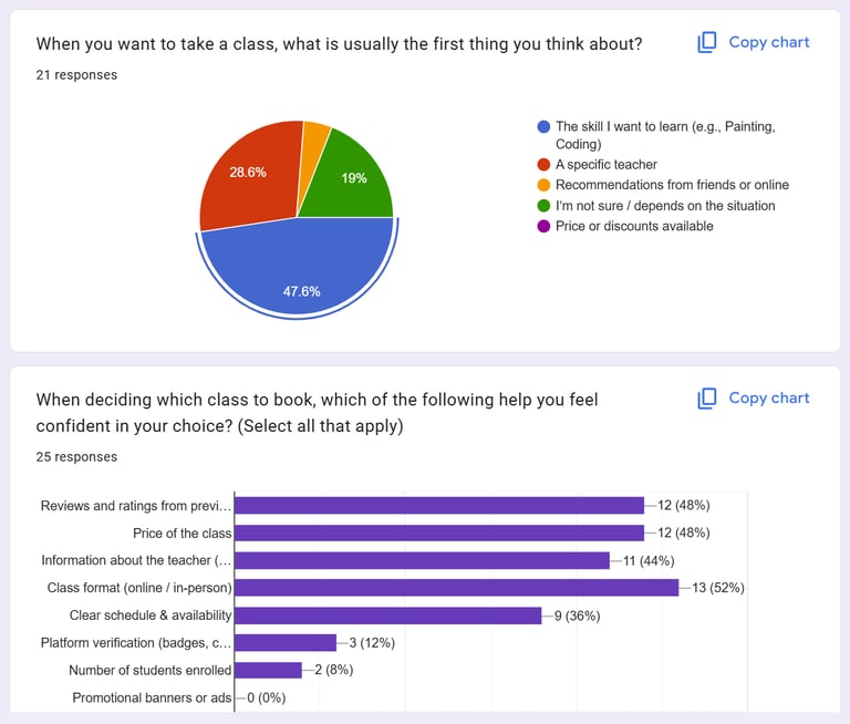
Survey
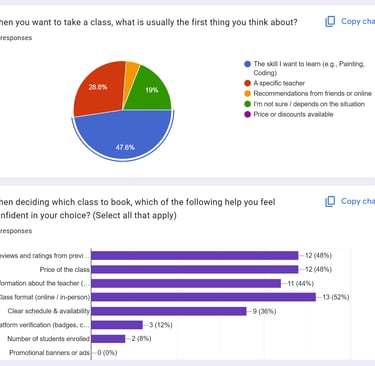
We collected 26 responses from learners who recently took online or in-person classes. Our aim was to uncover how they discover classes, what challenges they face, and what factors build trust and confidence.
Key Takeaways:
Users search for skills first, not tutors.
To decide efficiently, they need key information upfront: price, level, format, rating.
Based on these survey results, we invited 6 interested participants for in-depth interviews to gather qualitative insights for design decisions.
We conducted our research in two phases:
Phase 1: Survey and Interview (Affinity Diagram)
Phase 2: Competitive Analysis
Based on our interviews and survey responses, we organized qualitative insights using affinity Diagram .This method helped us cluster similar observations, identify patterns, and translate them into actionable design decisions.
Interview and Affinity Diagram
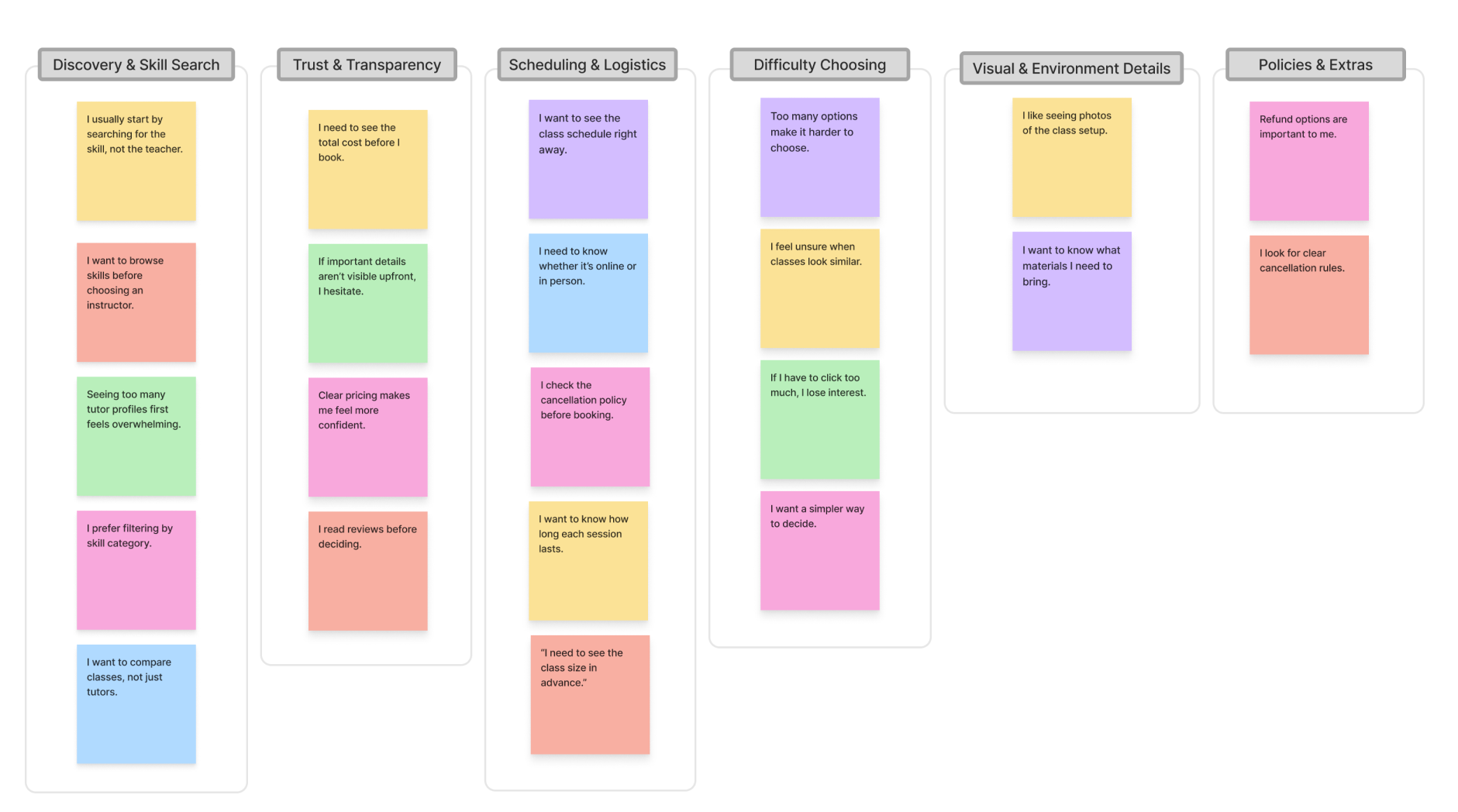
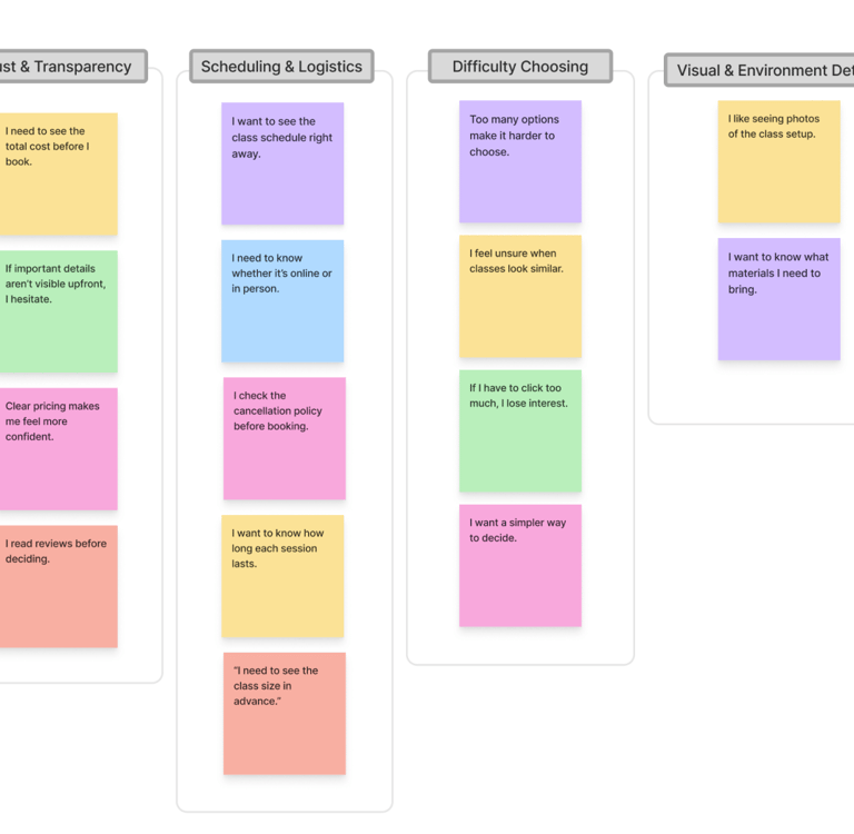
Takeaways:
Discovery & Skill Search:
Learners focus on skills, not instructors. By prioritizing skill categories on the homepage, we guide users to find relevant classes quickly without feeling overwhelmed.Trust & Transparency:
Users need clear, upfront information (price, ratings, format) to make confident decisions. Surfacing these details on course cards reduces friction and builds trust.Scheduling & Booking:
Confusing date/time layouts cause hesitation. Clear visual mapping of schedules simplifies booking and reduces decision fatigue.Difficulty Choosing:
Too many unclear options lead to drop-offs. A simplified flow, inspired by e-commerce patterns, helps users focus and complete their booking efficiently.
Competitive Analysis
The next step in our research involved identifying successful patterns in current products and missing gaps. We explored different products and narrowed them down to four top competitors: Superprof, Domestika, Wyzant, and Udemy.
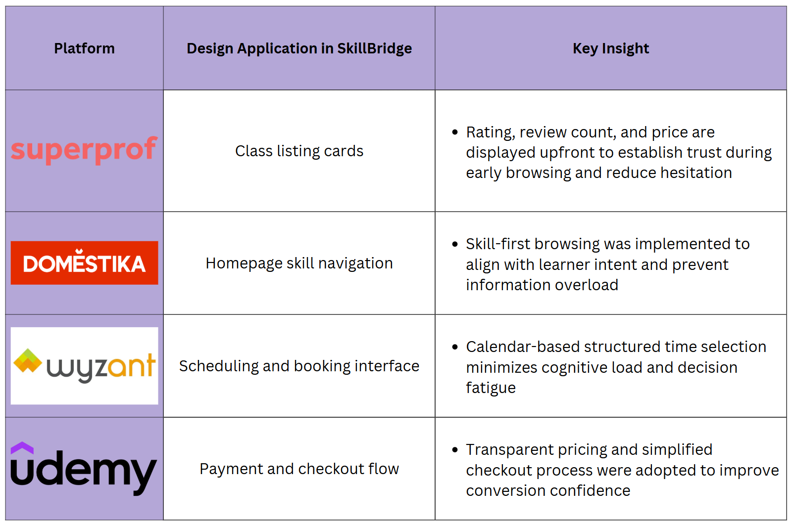
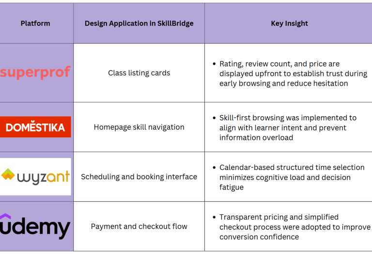
Takwaway
Platforms like Udemy and Domestika make discovery easy but lack local, one-to-one teaching.
Tutoring platforms such as Wyzant or Superprof are powerful, yet often feel complex and expensive for casual learners.
Trust signals (reviews, badges, verified profiles) strongly influence decision-making.
Define
Refined Problem Statement
Based on research insights, learners struggle to efficiently discover and compare skill-based classes due to unstructured information, unclear scheduling, and overwhelming choices.
This lack of clarity creates hesitation, reduces trust, and increases drop-offs before completing a booking.
The core challenge was to design a structured, transparent, and confidence-driven experience that supports faster and more informed decision-making.
Structuring the Experience
We structured the platform around one main journey: from discovering a skill to booking a class with confidence. This kept the information architecture focused and reduced decision fatigue.
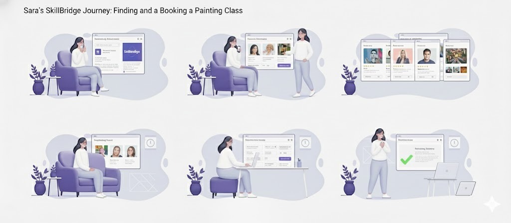
User Scenario
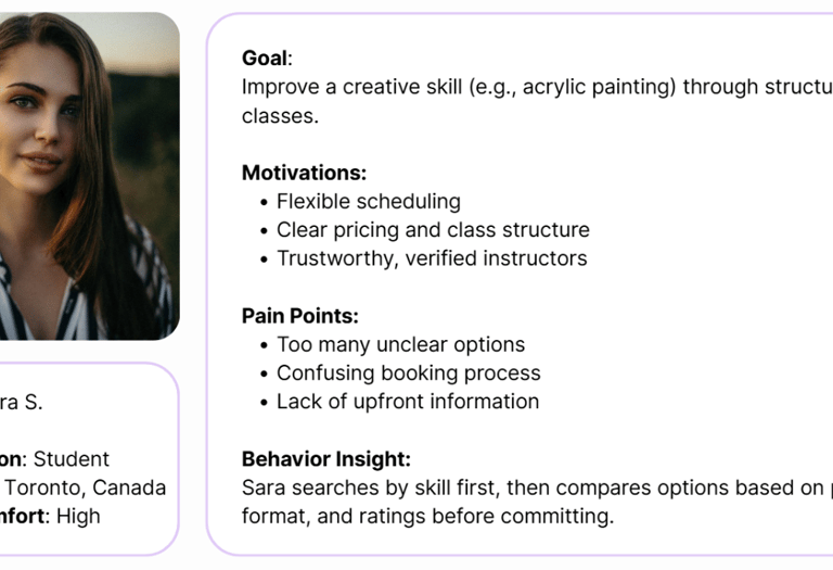
Sara discovers SkillBridge while searching for painting classes. She wants to quickly see what’s available, compare a few tutors, check schedules against her evenings, and book without worrying about hidden costs or complicated steps.
The experience must guide her through a calm, predictable flow where each step makes the next decision easier instead of harder.
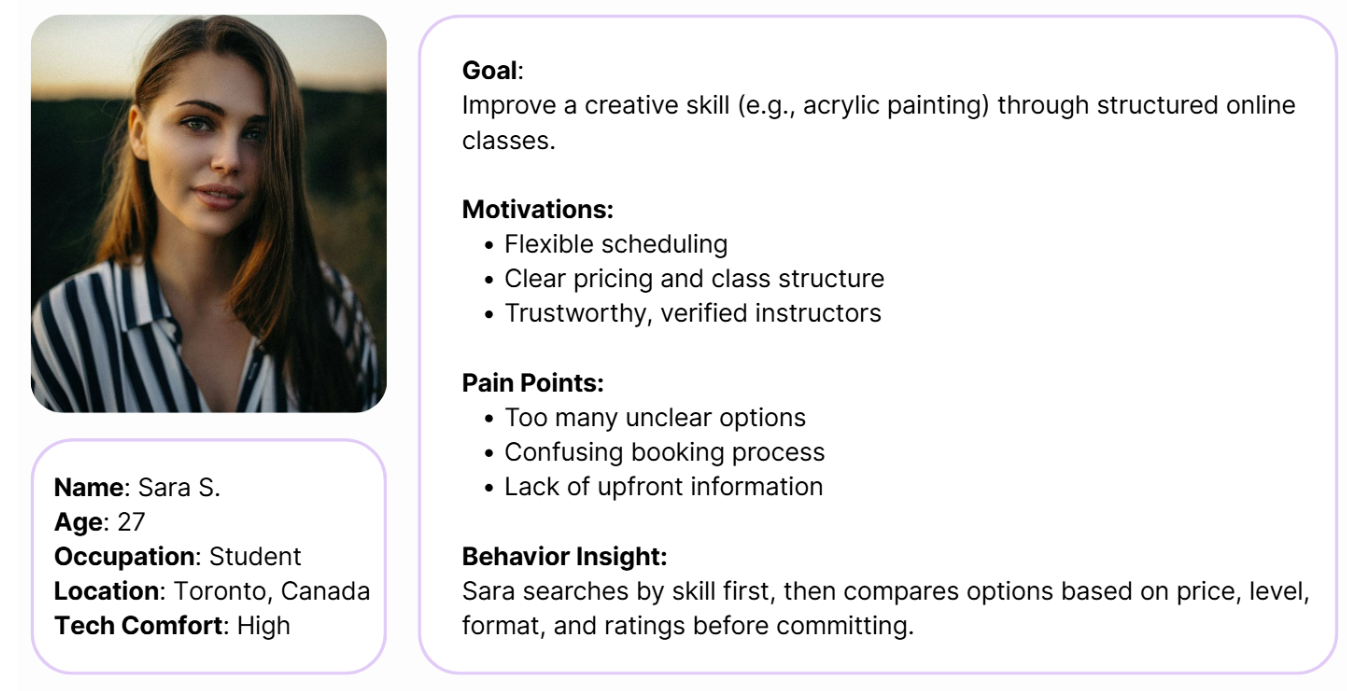
Persona
In order to establish tasks for our design, and to communicate information about the users that we collected during research, we developed a persona and a scenario.
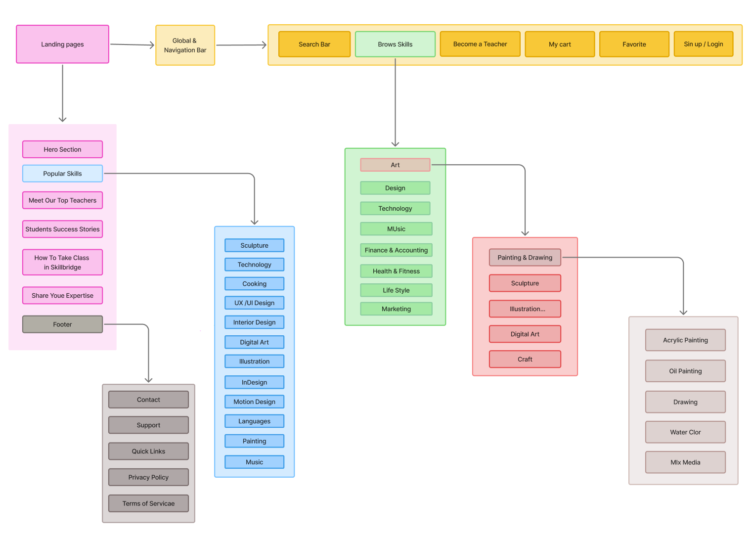
Information Architecture (Sitemap)
To align with users’ mental models and reduce cognitive overload, the platform structure prioritizes skill-first discovery and simplified booking flows.
Develop
Mid-Fidelity Wireframes
Early Mid-fidelity sketches allowed us to quickly explore layouts for skill discovery, tutor profiles, and booking steps. We tested different positions for filters and calls-to-action, focusing on reducing visual noise.
Mid-fidelity wireframes helped align the team on hierarchy and content structure before investing in detailed UI.
Deliver
Moodboard & UI Design System
Visually, we wanted SkillBridge to feel energetic and optimistic while staying calm enough for learners of all ages. Purple became our main brand color to represent creativity, paired with warm accents and soft neutrals.
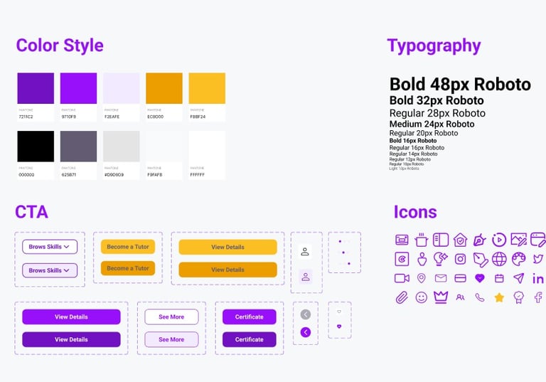
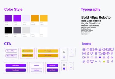
We built a UI system to keep the product consistent and scalable: typography styles, color tokens, buttons, cards, and iconography.
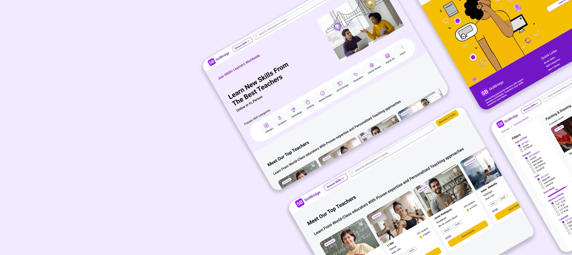
High Fidelity Mockups
After validating the flows, we moved into high-fidelity design and refined the details of each core screen: homepage, search, tutor profile, booking, and payment confirmation across both desktop and mobile.
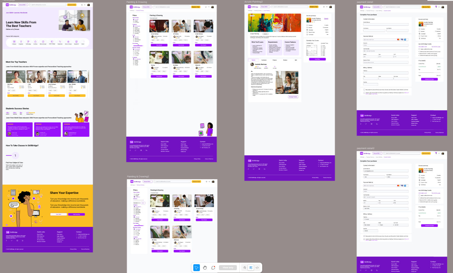
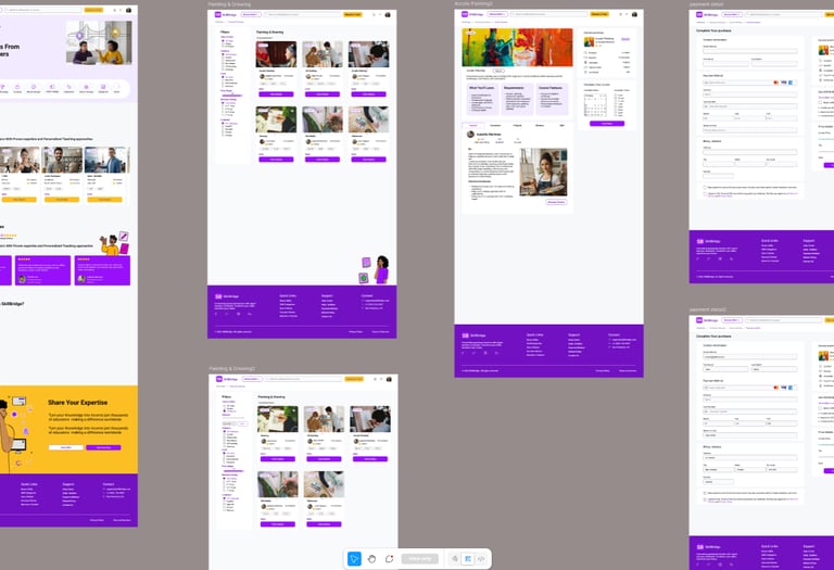
Final High-Fidelity Designs of Some Desktop Pages
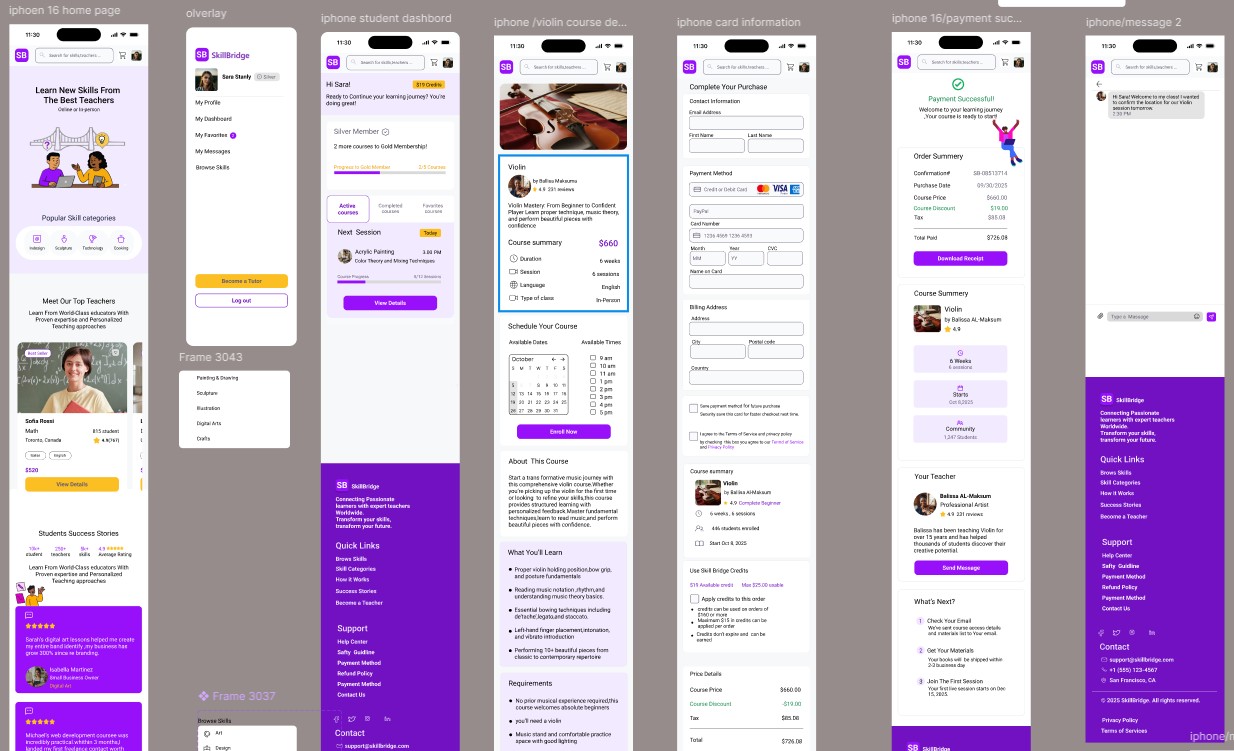
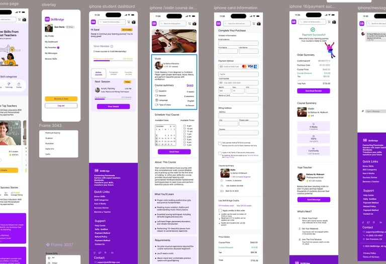
Final High-Fidelity Designs of Some Mobile Pages
Usability and Iteration
Validating the Experience
Key Findings & Changes
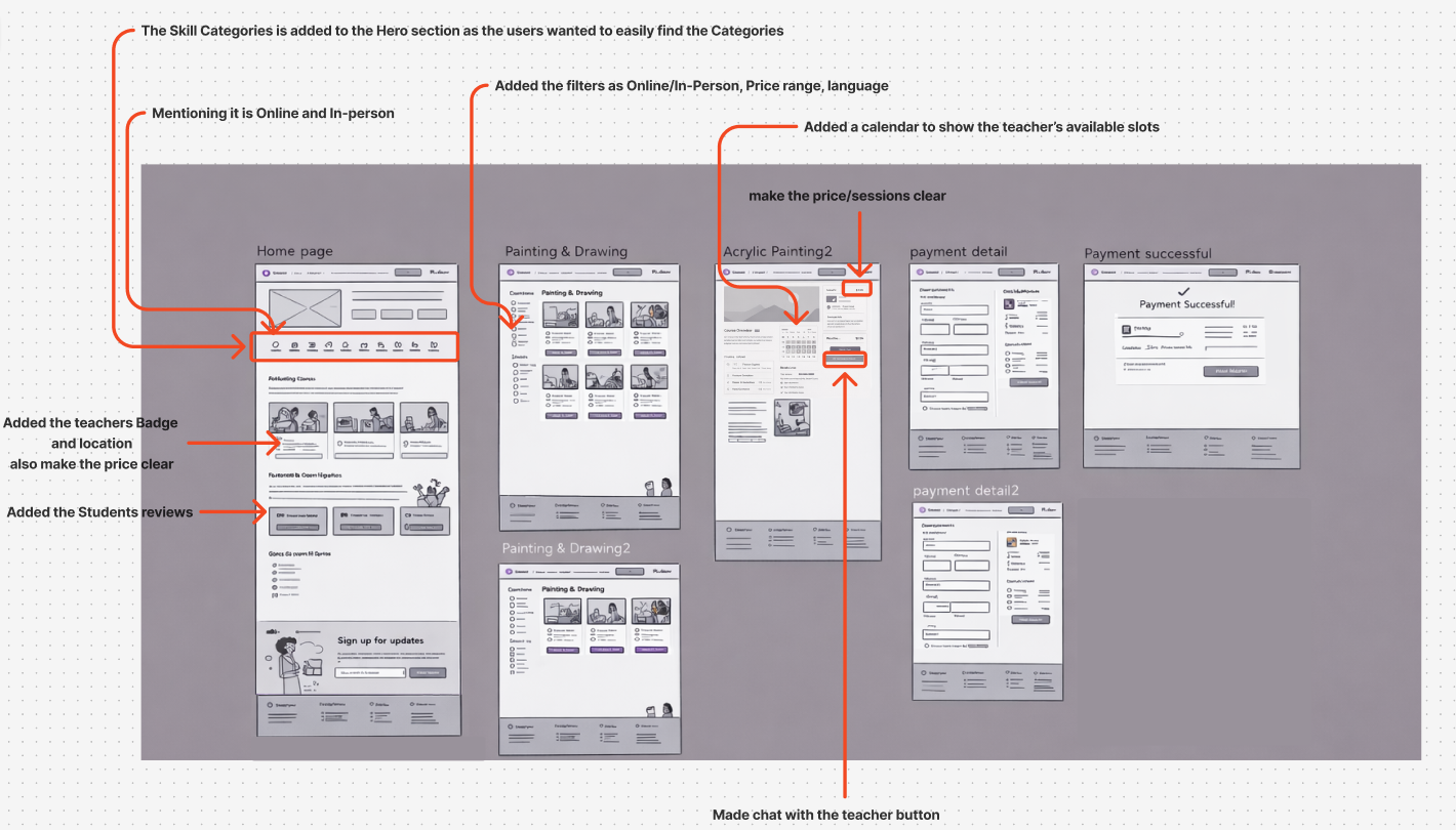
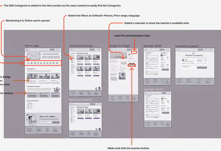
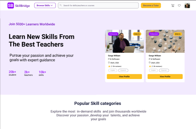
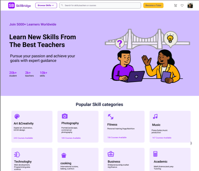
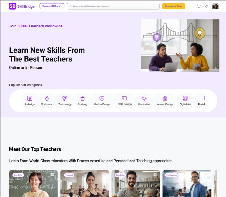
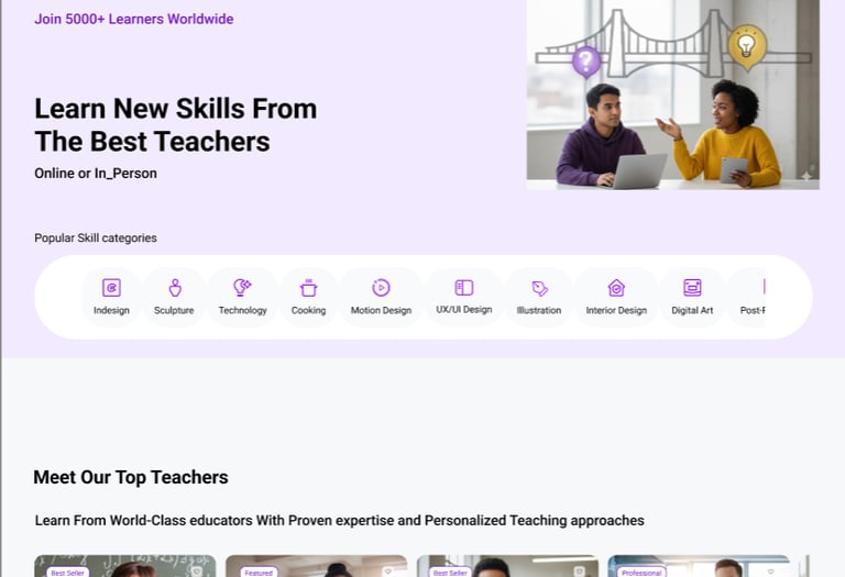
1️⃣ Learning Categories as the Primary Entry Point
Users came to SkillBridge looking for specific skills, like Acrylic Painting not tutors. They ignored tutor-focused hero content.
What changed
→ We prioritized skill categories at the top of the homepage
→ Clear visual icons + labels for faster scanning
→ One-tap entry into painting category
Version I
Version II
Version III
First Task Result
Updated Version
The final concept for SkillBridge enables users to quickly discover and book the right Acrylic Painting class through clear skill categories, easy course comparison, and a simplified checkout experience. Learners can explore a variety of creative courses, review class details with confidence, and add sessions to their cart with a familiar, friction-free purchase flow.
Key Takeaways
• Prioritizing skill categories (e.g., Acrylic Painting) reduces decision friction and speeds discovery
• Class cards must highlight essential decision details: format, level, rating, and price
• Showing valuable info early improves user confidence before they invest time reading details
• A simple “Add to Cart” checkout flow feels intuitive and reduces hesitation
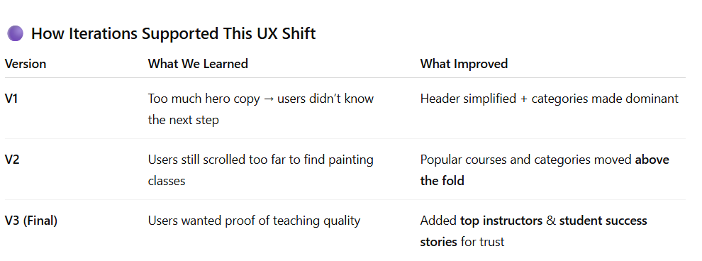
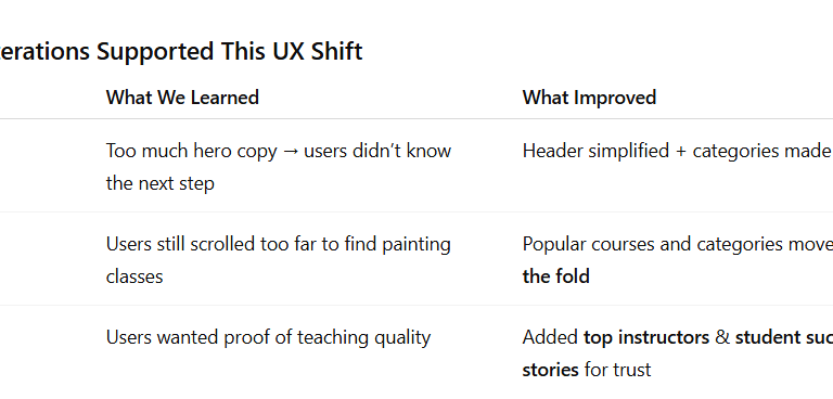
2️⃣ Focus on Course Discovery
Users needed to compare classes first, and only then look into tutor details if necessary.
What changed
→ Course cards now surface the key decision info:
• Skill type (Acrylic Painting)
• Session format (Online / In-Person)
• Price
• Reviews
→ Tutor details are moved inside the course as supporting information.
Old Iteration– filters hidden in dropdowns and visually disconnected from course results. Users often missed which filters were applied.
Refined Iteration– filters surfaced and grouped clearly, with visible result count. Users quickly understood how their choices shaped the Painting & Drawing results.
Second Task Result – Filters for Painting & Drawing
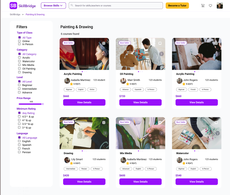
Before (1 – Old Iteration)
In the first version of the Painting & Drawing results page:
The filter panel on the left was collapsed into dropdown sections (“Filters” with accordions).
Users saw the course cards but couldn’t easily tell which filters were available or applied.
There was a lot of empty space between the filter area and the course grid, so their eyes went straight to the cards and they ignored the filters.
During testing, several participants had to “double-check” the left panel or forgot which options they had selected.
Result: Users weren’t fully confident that they were seeing the right set of Acrylic / painting classes.
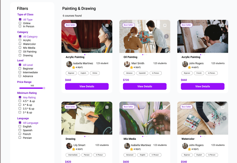
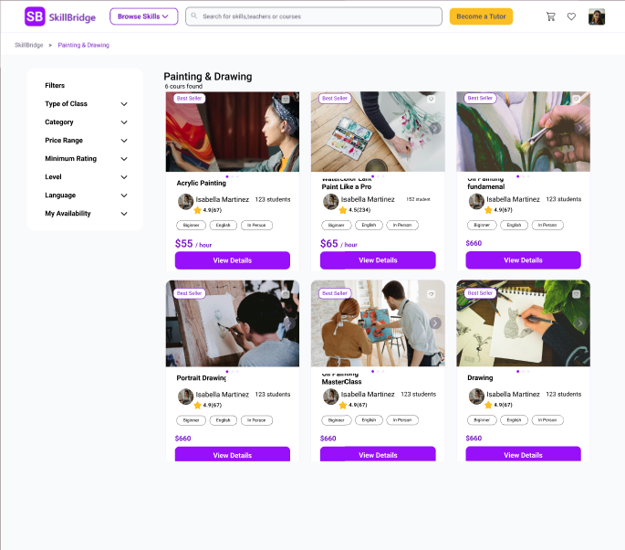
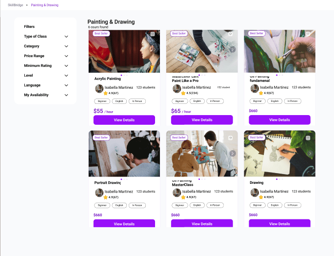
After (2 – Refined Iteration)
In the refined version after usability testing:
The filter column is always open and fully labeled (“Type of Class”, “Category”, “Level”, “Price Range”, “Minimum Rating”, “Language”).
Checkboxes and the price slider are immediately visible, so users understand at a glance how they can narrow down Acrylic Painting classes.
The title “Painting & Drawing – 6 courses found” gives clear feedback that filters have been applied and how many results they’re affecting.
The visual gap between filters and courses is reduced, which creates a stronger connection between the left panel and the course grid.
Result: Users understood which filters were controlling the results and felt more confident exploring and comparing painting classes.
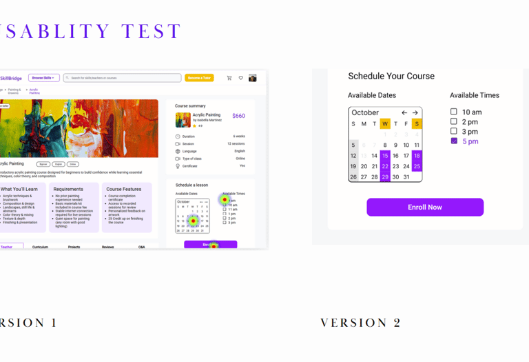
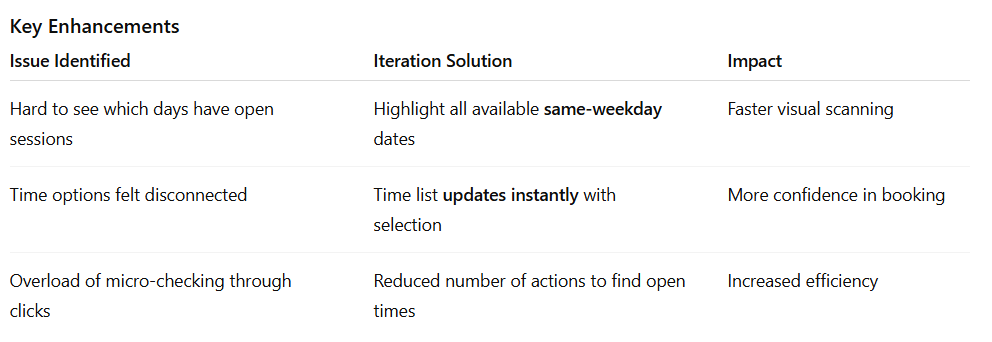
3️⃣ Clear Date–Time Matching During Scheduling
Users struggled to see which times belonged to the selected date.
What changed
→ Dates and times are now visually connected
• Selecting a day highlights matching weekday slots
• Available times appear instantly on the right
• Filters stay open and clearly labeled
→ Creates a clear, predictable flow for choosing the right class time.
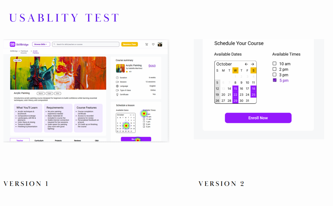
Old layout – Users struggled to understand which time slots were associated with the selected date. The date and time options were visually disconnected, causing confusion and extra clicks to find availability.
Refined layout – Selecting a date now highlights all available sessions for that weekday, and corresponding times are shown instantly. This clear visual connection improves efficiency and confidence during scheduling.
Third Task Result – Users Struggled to Match Dates with Available Times
Goal: Schedule a class at a suitable date & time
In the first design (Version 1), users were unsure which class times corresponded to which selected day:
The calendar and time selector were not visually connected
Users clicked multiple dates to hunt for availability
The heatmap showed high confusion around the calendar area
Feedback: “I don’t know which day actually has this time…”
This resulted in hesitation and slowed booking decisions.
Design Improvement | Clear Visual Mapping Between Date & Time
In the updated version, we improved comprehension and flow by connecting interactions:
When a user selects a date :
➡ All matching weekday slots are highlighted in the calendar
➡ The paired available class times are immediately revealed on the right
This gives users a clear mental model of availability. In the refined version after usability testing:
The filter column is always open and fully labeled (“Type of Class”, “Category”, “Level”, “Price Range”, “Minimum Rating”, “Language”).
Checkboxes and the price slider are immediately visible, so users understand at a glance how they can narrow down Acrylic Painting classes.
The title “Painting & Drawing – 6 courses found” gives clear feedback that filters have been applied and how many results they’re affecting.
The visual gap between filters and courses is reduced, which creates a stronger connection between the left panel and the course grid.
Result: Users understood which filters were controlling the results and felt more confident exploring and comparing painting classes.
Final Prototype
The final experience follows a streamlined path:
Discover Skill → Select Category → Filter Results
Compare Tutors → View Class Details
Choose Time → Checkout → Confirmation
This e-commerce-inspired structure reduced cognitive load and made the process feel familiar and trustworthy.


Reflections
The final concept for SkillBridge brings together clear discovery, rich tutor profiles, and a streamlined booking flow. Learners can quickly filter tutors by what matters most to them location, language, price, and schedule and feel confident when booking a class.
Key Takeaways
Balancing user needs with business goals is crucial when designing pricing, credits, and rewards.
Small adjustments in hierarchy and microcopy can significantly improve trust on tutor and payment screens.
Iterative testing, even with a small group, reveals patterns that aren’t visible from design alone.
Expected Impact
Learners can discover Acrylic Painting and other creative classes faster through simplified category navigation.
Clearer class cards and familiar checkout patterns improve purchase confidence and reduce hesitation.
A more scalable structure supports the expansion of creative skills and future filtering enhancements.
What I Learned
Visually aligning filters and results dramatically impacts perceived clarity and trust.
Small UI changes (labels, spacing, visibility) can make users feel more in control of decisions.
Frequent user feedback helps validate assumptions and remove unnecessary complexity.
What I’d Explore Next
Support more detailed class scheduling visibility to help users pick the best time faster.
Add personalized recommendations based on skill level or related painting styles.
Test additional filter layouts (chip-based, sticky bar for mobile) to further reduce cognitive load.
Expand beyond painting to other creative skills once the model is validated.