Website Redesign
A full UX redesign that turns a confusing clinic site into a clear, confidence-building experience.
Saving Faces Skin Care
PROJECT OVERVIEW
What is Saving Face Skin Care?
Saving Faces is a skincare service provider offering a range of professional treatments.
The website serves as a key touchpoint where users search for treatments, learn about services, and book appointments online.


Tools
Figma, Photoshop, google Form, Open AI, Maze
Duration
8 Weeks/ Part-time
Role
UX Designer
Team
Group of 4


The Problems
Stakeholders reported repeated issues with the existing website experience, as customers struggled to find and select the correct skincare services.
Although users arrived with the intent to book a treatment, unclear service categorization and a fragmented booking process made it difficult for them to complete the task independently.
As a result, users frequently abandoned the booking flow or contacted customer support for assistance, indicating a breakdown in the self-service experience.
Design Goals
The goal of this redesign was to simplify the service booking experience by removing friction, improving clarity, and guiding users through a clear, linear booking journey.
The plan focused on redesigning the end-to-end booking flow from service discovery to confirmation while aligning the experience with user expectations and decision-making behavior.
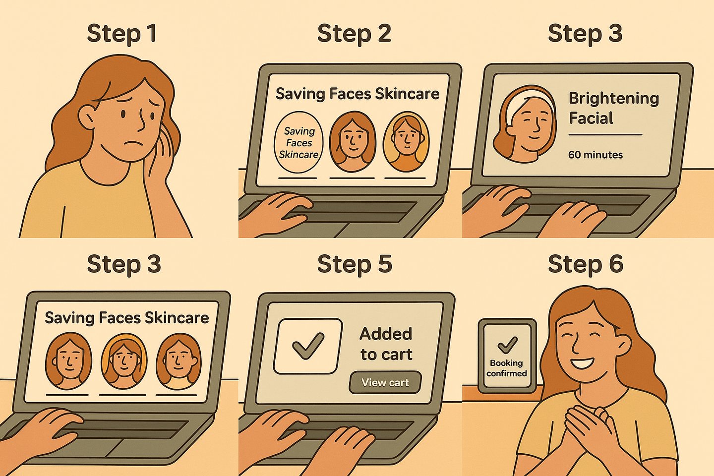
Primary User Task
Book a skincare service by:
Searching for a specific treatment
Reviewing service details
Selecting a preferred option
Entering personal information
Receiving booking confirmation
Research Methodology
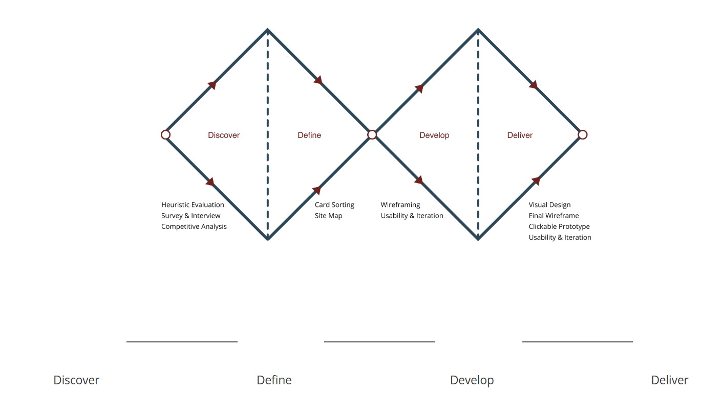
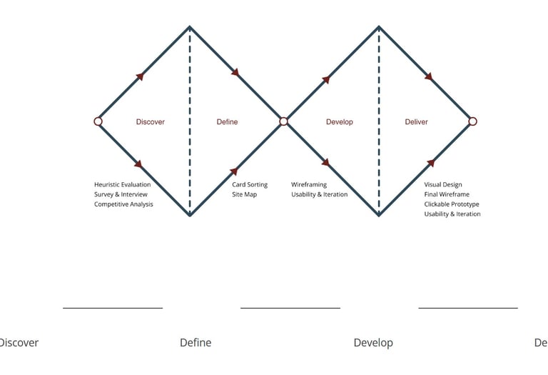
We followed a lean Double Diamond approach — Discover, Define, Develop, Deliver — combining surveys, heuristic evaluation, and competitive analysis.
We reviewed the existing site, read client reviews on Yelp, Facebook, and Instagram, and mapped all the pain points we could find. From our survey and heuristic review of the old website, we saw the same pattern repeated:
Services were listed with vague names and little explanation.
No information about who would perform each treatment.
No before-and-after results or real testimonials.
Booking felt like submitting a generic contact form, with no feedback.
DISCOVER
Understanding Clients & the Market
In the Discover phase, we set out to uncover our users’ real needs, frustrations, fears, and motivations, going beyond surface-level problems. These insights gave us a deeper understanding of their behaviours and expectations, forming a strong foundation to design solutions that truly meet their goals.We conducted our research in three phases:
Survey & Interviews – Surveyed 78 participants and interviewed skincare clients to understand goals, habits, and frustrations when researching clinics online.
Heuristic Evaluation – Evaluated the original Saving Faces website using Nielsen’s heuristics to uncover usability and trust issues.
Competitive Analysis – Benchmarked modern skincare and med-spa brands such as Heyday, Glowbar, and SkinSpirit.
Survey & Interview
We collected responses from potential and existing skincare clients to understand what builds trust and what frustrates them when researching clinics online.
Clear service descriptions and pricing.
Information about staff qualifications.
Before-and-after photos to prove results.
Modern, clean design that feels professional.
Easy online booking with confirmation.
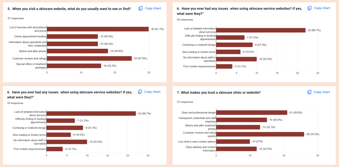
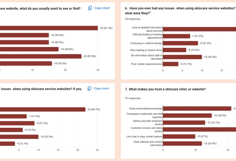
We surveyed 78 participants to understand their goals, habits, and pain points around managing their skin, choosing products, and getting trustworthy skincare advice. We also asked about their previous experiences with skincare apps and online consultations.
What people expect from skincare websites
Learning from other clinics
We benchmarked modern brands like Heyday and Glowbar to understand how they:
Group services into categories.
Communicate trust and expertise.
Design their booking flows for clarity.


“My schedule is packed, so I don’t have time to research every product.”
So having simple, guided recommendations is very important to me
“I’m always worried new products will irritate my skin.”
So I need clear ingredient information and to know what is safe for my skin type.
“I love trying new routines, but it’s hard to know what actually works.”
So I want personalized routines based on data, not just trends.
“I don’t really trust random reviews on shopping sites.”
So I prefer expert-backed advice and seeing real before–after results.
“Skincare can get expensive, and I don’t want to waste money.”
So I need transparent pricing and to know which products are really worth it.
Heuristic Evaluation
Identifying Usability Issues
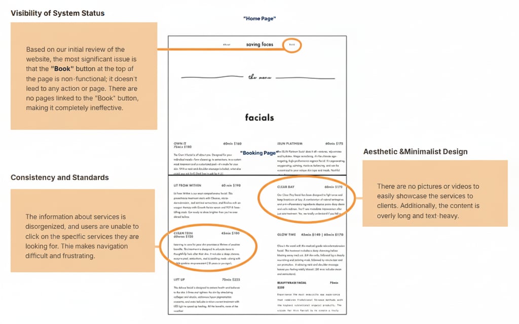
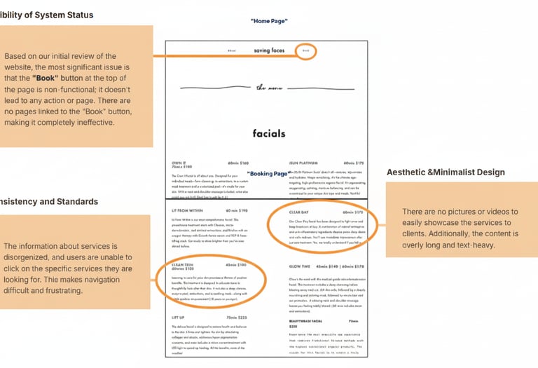
To get a better understanding of what issues to focus on, we conducted a heuristic evaluation of the existing Facing Safe experience using Nielsen’s heuristics to uncover friction points related to visibility of system status, match between system and real-world language, error prevention, and aesthetic & minimalist design.
System Feedback
Observation: User actions like booking or clicking buttons lack confirmation or loading feedback.
Suggestion: Add visual cues (e.g., spinners, confirmation messages) to show system responses.
Language and Clarity
Observation: Terms like “Corrective Facials” may be unclear to non-experts.
Suggestion: Use plain language or brief explanations for technical skincare terms.
User Navigation Control
Observation: Limited ways to go back or retrace steps.
Suggestion: Add breadcrumbs or visible “Back” buttons for better navigation.
Visual Consistency
Observation: Fonts, button styles, and layouts vary across pages.
Suggestion: Apply a unified visual style across the site for consistency.
Error Prevention
Observation: Forms lack field validation or helper text.
Suggestion: Use real-time form validation and tooltips to reduce user errors.
6. Memory Load
Observation: Users must remember details between service and booking pages.
Suggestion: Show service summaries or hover previews during booking.7. Efficiency and Flexibility
Observation: No search bar, filters, or quick-access tools.
Suggestion: Add search functionality, filters, and personalized recommendations.8. Visual Simplicity
Observation: Homepage and some sections are visually cluttered.
Suggestion: Simplify layout, use whitespace strategically, and highlight key actions.9. Error Recovery
Observation: Forms lack clear error messages or field highlights.
Suggestion: Show specific, human-readable error messages to guide correction.10. Help and Support
Observation: Little guidance for new users—no FAQs or how-to content.
Suggestion: Add a Help/FAQ section or onboarding prompts to support first-time visitors.
Heuristic Evaluation – Key Issues
Language & Clarity – Technical treatment names with little explanation.
Navigation Control – Limited ways to go back or change decisions.
Visual Consistency – Mixed typography and UI patterns that felt dated.
Error Prevention – No inline validation in forms.
Help & Support – Minimal guidance for new visitors about where to start.
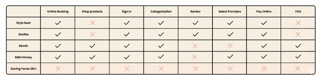
Competitive Analysis
Learning From High-Performing Skincare Brands
We analyzed several successful skincare and med-spa websites — such as Heyday, Glowbar, and SkinSpirit — to understand how they communicate trust and structure their booking flows.
Group services into clear categories: facials, advanced treatments, add-ons.
Show pricing, duration, and key concerns at a glance.
Feature strong “Book now” CTAs on every page.
Use testimonials, team bios, and before-and-after galleries to build trust.
Insights
The analysis shows that while market leaders invest heavily in clear booking flows, transparent pricing, and trust-building content, Saving Faces’ original site lacks most of these foundations. This gap shaped our redesign strategy: focus on clarity, trust, and a truly modern booking experience.
Key Takeaways
Reviewing competitors' features helped identify effective navigation strategies for the booking process.
Analyzing competitors' approaches to checkout design informed a streamlined and efficient process.
Examining competitors' review sections highlighted the importance of a well-organized customer review area.
Adopting a minimal and clear design was reinforced as a best practice for creating a user-friendly experience.
DEFINE
In this phase, we defined the persona, task flow, and user flow based on our research findings forming the foundation for all future sketches, redesign decisions, and iterations.
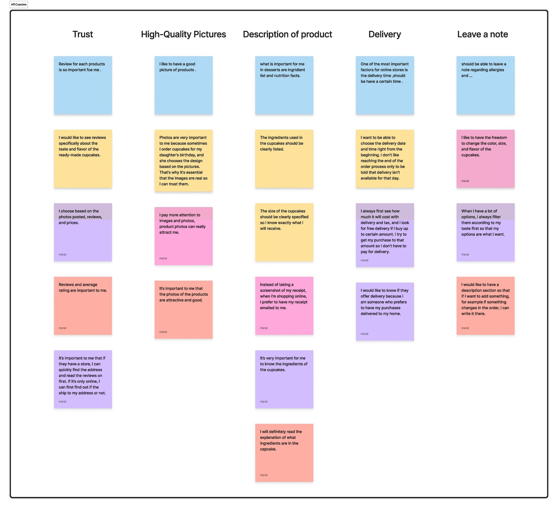
Affinity Diagram
We synthesized survey responses, competitive insights, and heuristic notes into an affinity diagram. Four themes emerged:
Trust & credibility: people need proof, not promises.
Clarity of treatments: names alone are not enough.
Navigation & flow: users want a guided path to booking.
Visual tone: dated visuals reduce perceived quality.
Framing the Problem
Problem Statement
First-time visitors to Saving Faces struggle to understand which treatments are right for them, whether they can trust the clinic, and how to book an appointment with certainty.
Design Principle
Every decision—from copy and layout to navigation—should lower anxiety, clarify options, and make the path to booking feel effortless.
Persona & Scenario
In order to establish tasks for our design, and to communicate information about the users that we collected during research, we developed a persona and a scenario.
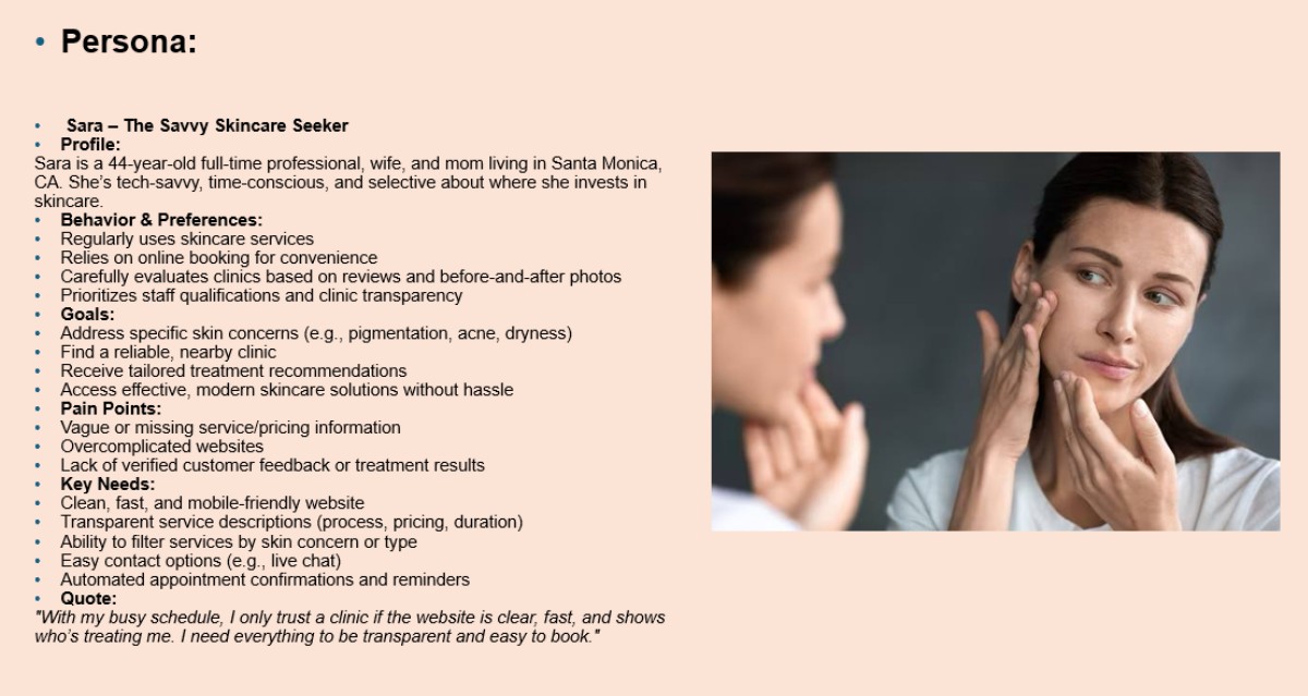
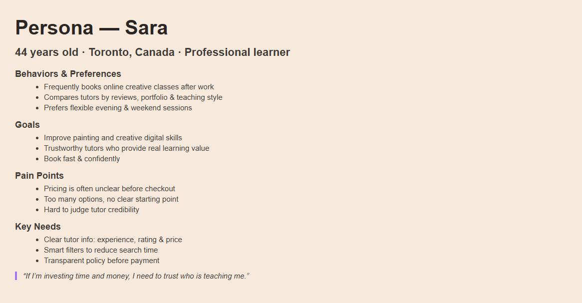
User Scenario
Book my first treatment on a Busy Workday
“I have 15 minutes in the evening to find a clinic, understand what they offer, and book my first treatment next week.”
Discover Saving Faces via search / Instagram.
Scan homepage to see if it feels professional and trustworthy.
Explore services to find a treatment that matches her concern and budget.
Read what to expect, check staff, see results.
Book a time that fits her schedule.
She receives a clear confirmation.

We mapped Sara’s primary scenario into a concise journey, which became the backbone of the site structure and content decisions.
Develop
Structuring & Designing the Experience
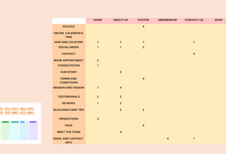
Information Architecture & Final Sitemap
We simplified the site into a structure that supports how clients actually search, compare, and commit to treatments:
Home – Promise, key benefits, social proof, and primary “Book Now” CTA.
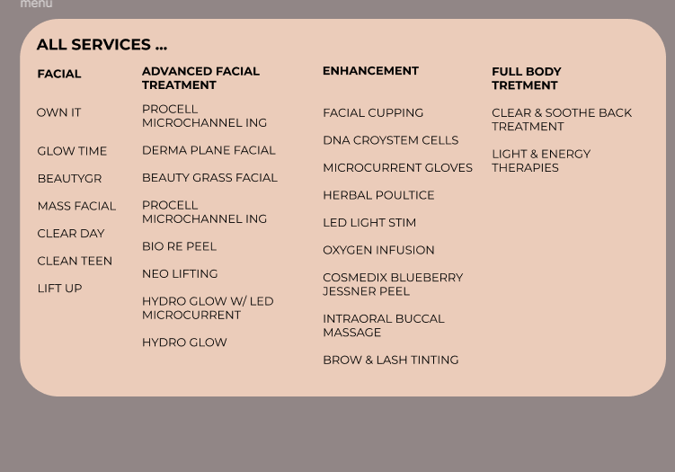
Services – Facials, Advanced Treatments, Add-ons with benefits, duration, and pricing.
About – Story, team bios, qualifications, and clinic values.
Membership & Promotions – Packages, loyalty credits, and seasonal offers.
Book Appointment – Guided booking flow with summary and confirmation.
FAQs & Science Tips – Safety, aftercare, and educational content.
Contact & Location – Map, hours, and contact options.
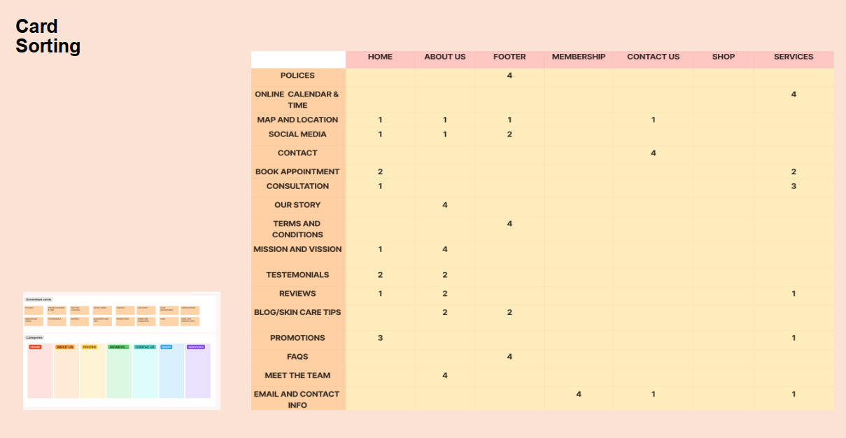
Card Sorting
We ran a card sorting exercise with participants to see how they would group pieces of content like services, testimonials, promotions, and FAQs.
Services grouped as Facials, Advanced Treatments, and Add-ons.
Story, team, and testimonials clustered naturally under “About”.
Memberships and promotions formed a distinct “Offers” area.
This gave us confidence that our navigation labels and page groupings matched users’ mental models.
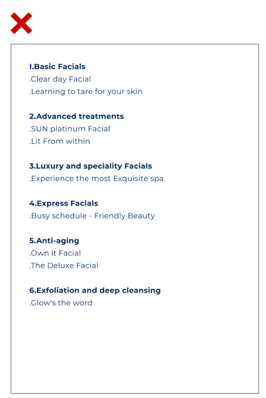
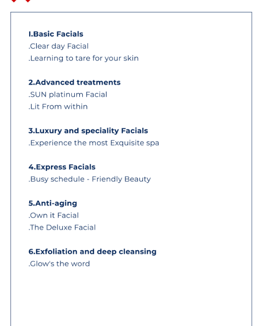
Challenge 1:
Correct Classification: Ensuring services were accurately categorized.
Avoiding Overload: Preventing users from being overwhelmed with too much detail.
Clear Navigation: Keeping navigation straightforward and intuitive.
Balancing Feedback: Aligning stakeholder feedback with user needs.
Solutions:
Initially, we categorized the services based on the existing descriptions, on the website. After presenting these categories to the stakeholders, we received feedback that some of the categories were not accurate. The stakeholder suggested additional categories that were very helpful.
Through Four meetings with the Stakeholder , we refined the Categories. We concluded that the Final categorization, Which addresses the high demand and variety of services on the website, best meets the needs of users and the business.

What redesign decisions did we make?
The most important takeaways from our research are challenges and solutions.
Challenge 2:
Users often call to confirm if the selected service is appropriate for their needs.
Reduce user uncertainty and improve Confidence in service selection.
Solutions:
Added detailed service descriptions within the booking carts.
Provided extra information to guide users in choosing the most suitable services.
Implemented clear, accessible explanations to ensure users understand their choices.

Challenge 3:
The original website's book button was not functional, making it difficult for users to schedule appointments. Additionally, the button was not easily accessible across different pages, creating frustration for users who wanted to book services quickly.
Solutions:
We resolved this by placing a functional book button on the navigation bar, ensuring it's prominently displayed and accessible on every page. This allows users to book appointments easily, regardless of where they are on the site.
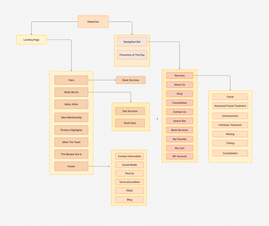
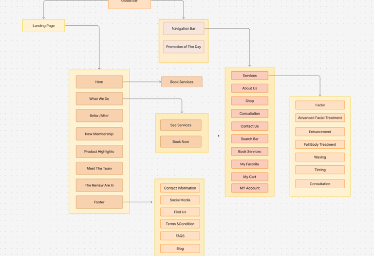
Final Sitemap
Home
Services (Facials · Advanced · Add-ons)
About (Story · Team · Reviews)
Membership & Promotions
Book Appointment
FAQ & Skincare Tips
Contact & Location
DELIVER
Mood Board
Translating The Physical Clinic Into a Digital Mood
We aligned the digital experience with the physical studio using a warm, calm visual language:
Warm neutrals and terracotta tones that echo natural skin and spa materials.
Close-up photography of real skin and textures to emphasize authenticity.
Rounded images and cards that soften the layout and feel approachable.


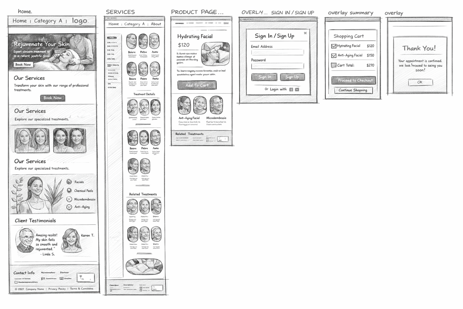
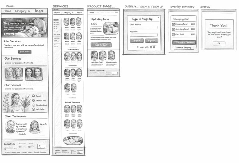
Low Fidelity Mockups
We started with low-fidelity wireframes to validate hierarchy, CTAs, and flow. Once we were confident in the information structure, we moved to mid-fidelity layouts to fine-tune spacing and component behaviour.
Homepage variants testing hero messaging and CTA placement.
Service list layouts with different card densities.
Booking flow variations exploring single vs. multi-step forms.
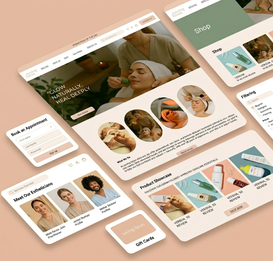
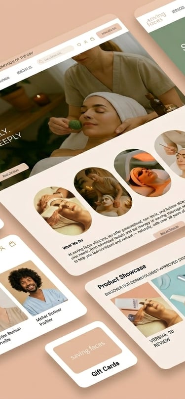
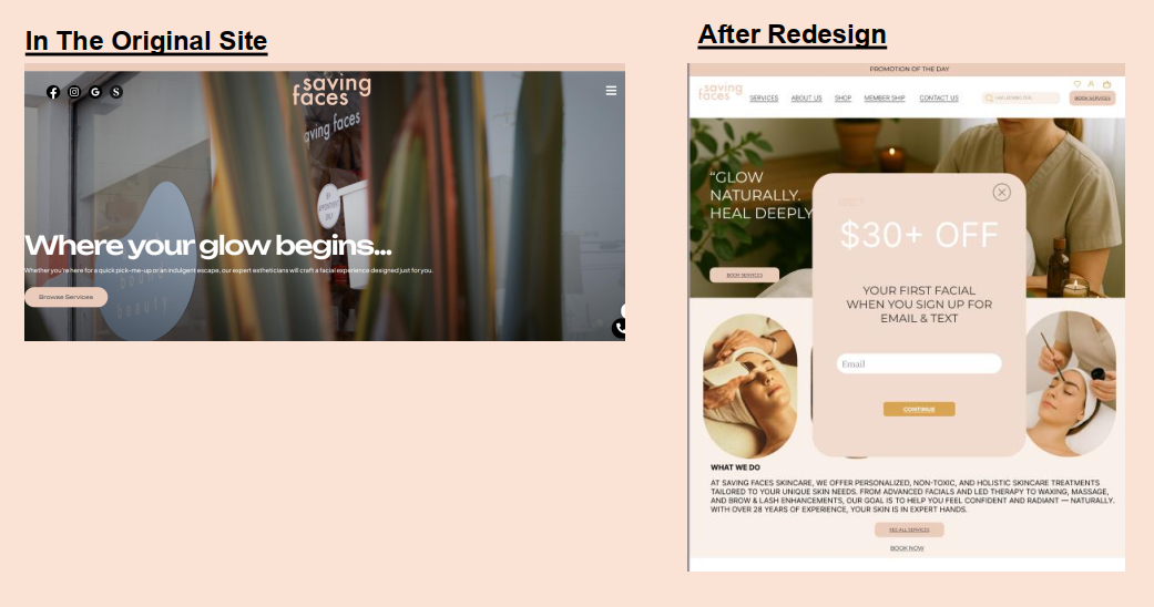
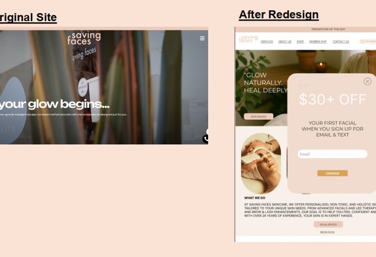
High Fidelity Mockups
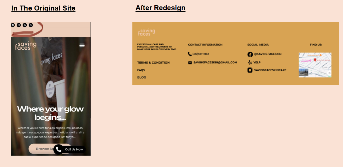
Finally, after implementing the changes and improvements, I arrived at the High Fidelity version, showcasing the final design ready for presentation. The final high-fidelity designs include:
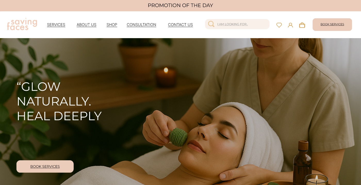
A homepage that immediately communicates the clinic’s promise, showcases real imagery, and highlights trust signals.
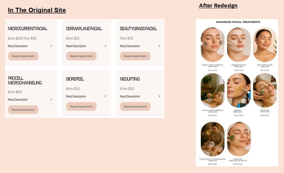
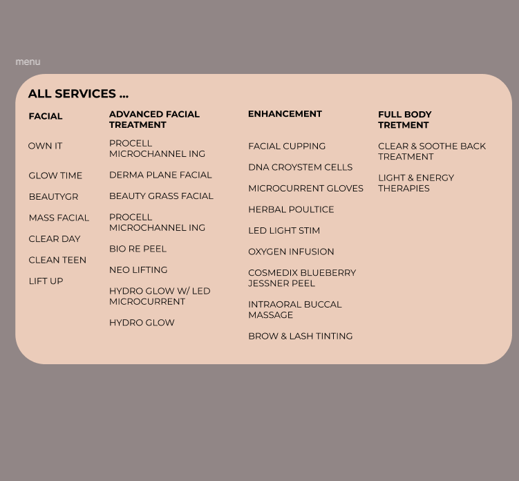
A services hub with filterable categories, clear pricing, durations, and “good for” tags.
Treatment detail pages that describe what to expect, contraindications, and before-and-after photos
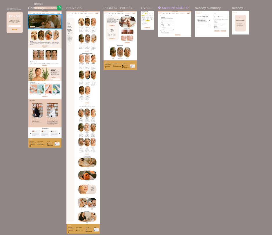
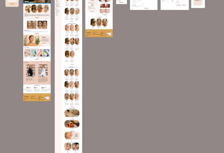
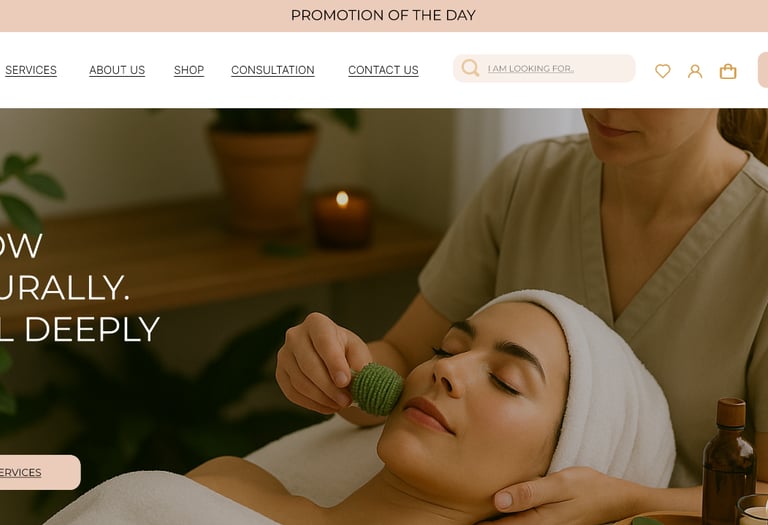
Final High-Fidelity Designs of Some Desktop Pages
Final Prototype
In this section, you can check out the complete final prototype.


We delivered clickable Figma prototypes for both desktop and mobile to walk stakeholders through the experience end-to-end.
What I Learned
In service-based experiences, trust is often the primary UX problem, not just navigation.
Small content decisions—naming, microcopy, and information order—have a big impact on how safe a treatment feels.
Combining heuristic evaluation, competitive analysis, and surveys provided a strong foundation when discussing trade-offs with stakeholders.
Expected Impact
Increase booking completion by reducing uncertainty about treatments, safety, and pricing.
Reduce pre-booking phone calls asking “Is this treatment right for me?” through better content and FAQs.
Strengthen trust and perceived professionalism via team bios, testimonials, and before-and-after proof.
What I’d Explore Next
Designing a membership experience with clear value and retention flows.
Expanding educational content (FAQs, skincare tips) based on real client questions.
Integrating an e-commerce experience for skincare products using the same system.
Running A/B tests on homepage hero messaging and booking CTAs.